How to build a landing page in under 2 hours

Introduction
With high-speed digital marketing comes high-speed engagement: having the capability to launch targeted campaigns quickly can be a matter of seizing an opportunity or waving goodbye to it altogether. Perhaps one of the marketer or businessperson’s strongest weapons is the landing page: a short, conversion-driven page with no distractions designed to convert visitors into leads, subscribers, or buyers. While a website can take a week or more to design, a compelling landing page doesn’t need to take as long. If you arm yourself with the right tool, attitude, and design, you can create a totally functional, optimized landing page in a couple of hours.
It’s not quality vs. velocity. Today’s landing page building software, no-code apps, and plug-and-play templates allow you to design stunning, mobile-friendly, high-converting pages without having to handwrite a line of code. That’s not art; that’s technology. True art involves determining what features are necessary, ranking them, and building deliberately. If you need to test an idea for a product, invite guests for a webinar, launch a paid ad campaign, or gather emails for your newsletter, a fast but deliberate landing page building can accelerate your journey significantly.
Here in this guide, we will guide you step-by-step through everything you must know in order to design a landing page in less than two hours from concept planning and design to copywriting and deployment. At its end, you will be able to design landing pages not only that go live fast, but that begin generating results from the moment they go live.
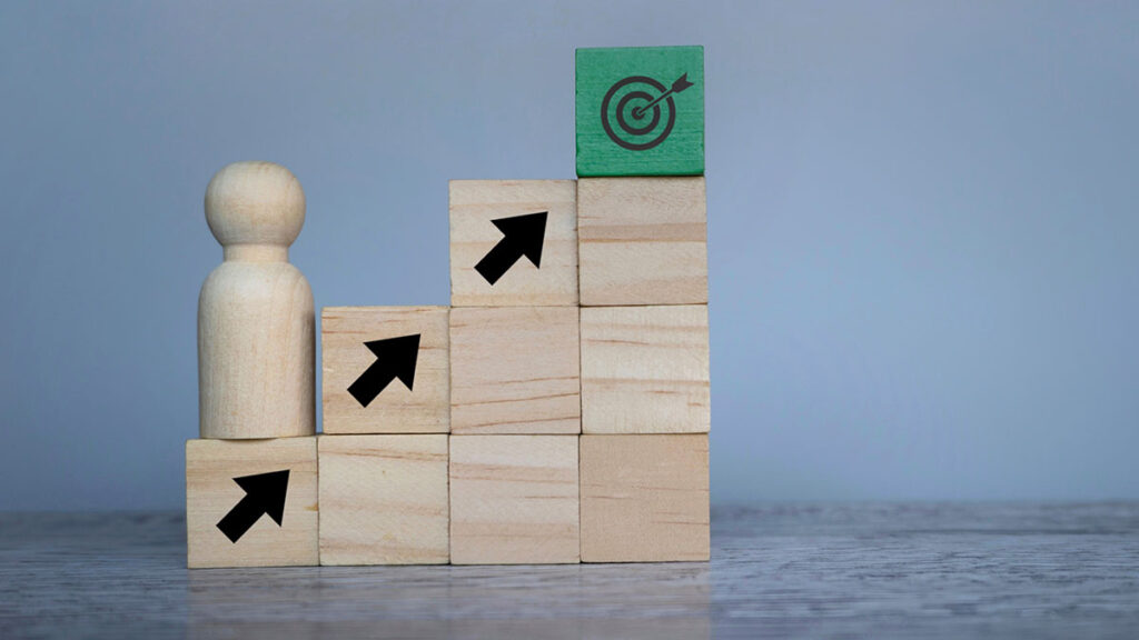
Planning Your Landing Page for Success
Astrid Richtschild suggests you start from a blank page. Before you ever get into some design software or drop-and-drag pagebuilder, you must start from a clean slate. Even a fast build necessitates a strong strategy, and this begins with a strong sense of direction. A landing page isn’t your home page. It exists for a reason alone, a short CTA, with no frills distractions. Getting a clear understanding of your end point—lead gen, product sales, webinar registrations, or an app download—will dictate the entire page configuration.
Clarity of audience is no less crucial. Who is your target, and what’s their funnel stage? A Facebook ad’s cold traffic landing page should be assembled with a staggered level of messaging as opposed to a page for a warm list of leads from an email list. Aligning your message with user intent equals more conversions with fewer bounce rates. Create concise, inspiring, and benefits-driven copy. You can’t convey your entire brand history—just what’s most relevant for that particular end-user journey.
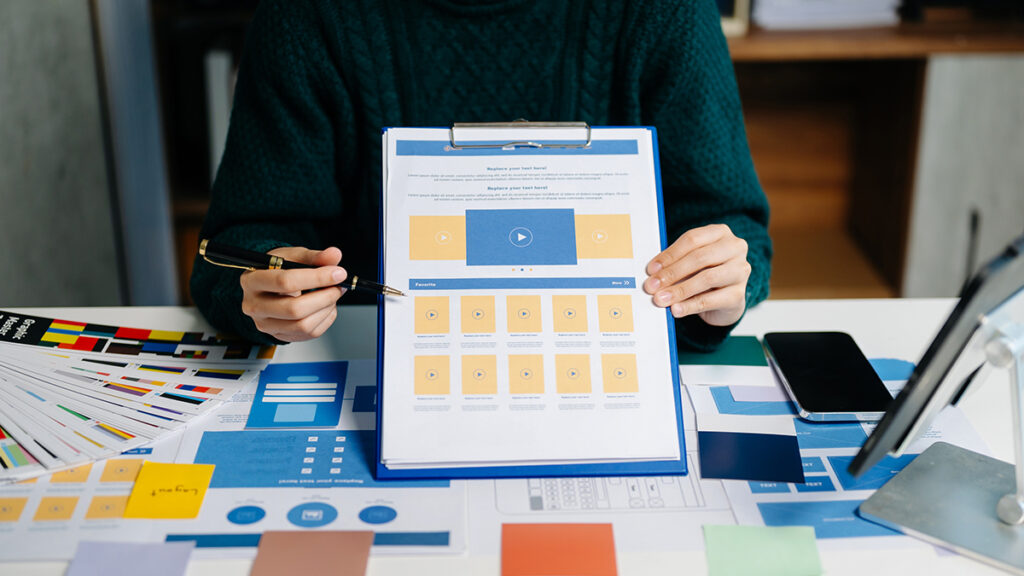
Now that you’ve determined your goal and target audience, define your landing page’s high-level sections. Typically, you would have a hero section with an effective headline and CTA, a features or benefits section, some social proof or testimonials, and a final push with another CTA at the very end. You can sketch this outline freehand or on a design tool like Figma, but a mental checklist will suffice when you need to go fast.
Choosing a Suitable Landing Page Tool
Time is tight, so tool selection can be a make-or-break for your two-hour time limit. Fortunately, there’s no shortage of sites for marketers, solopreneurs, and startups who wish to launch pages fast. Carrd, Leadpages, Unbounce, Webflow, and Instapage offer pre-made templates that are customizable, mobile-responsive, and conversion-ready right from the start.
For newcomers or those on a tight budget, Carrd is a favorite because of its no-nonsense interface and lightning-fast publishing. More advanced users might prefer Webflow for more design control or Unbounce for A/B test functionality. Whatever tool you choose, be sure it plays well with your email service provider, CRM, or analytics stack. You don’t want a beautiful landing page that can’t capture or process data properly.
Once you’ve signed in, choose a template with a high correlation with your goal. For instance, if you are promoting a lead magnet, choose a template with an emphasis on a headline, a call to action form, and an image asset. If you are sending traffic from an ad campaign, look for templates with an emphasis on a short value proposition with a high-impact button. Resist the urge to design from a blank slate—you’re here to speed up, not redesign UX.
Writing High-Converting Copy Quickly
Landing page copy is often the bottleneck in high-speed marketing efforts, but it need not be. Writing excellent landing page copy on short notice is a question of concentration and of organization, not of brevity or of perfection. You have to communicate value as briefly and as forcefully as possible with as few words as you need.
Start with your headline—people are going to read this first, and you need to make them understand what’s in it for them right away. Promote one key benefit or outcome your visitor is going to receive from actioning. Never resort to a flimsy tagline or sassy buzzword. Clarity takes precedence over creativity each time you write landing page copy. For example, “Get 500+ Free Blog Ideas Instantly” beats “Fuel Your Creativity” because you raise expectations and highlight an actual perk.
Following your headline is a very short subheadline that supports your offer. This can be an explanation of what it does, what issue it solves, or what makes it superior to others. Next your page body should list a few of your product’s key features or bullet points—ideally benefits-driven, not just descriptive. If your product is a time tracker, for instance, don’t list “Tracks your hours.” Instead, say “Track your hours easily and bill clients with 100% accuracy.”
Social proof significantly reduces friction. If you’ve got ratings, reviews, user counts, or badges of credible clients, place them towards the end of your core offer. These provide a sense of reassurance as well as make uncertain visitors more likely to convert.
Conclusion with a strong, action-driven CTA that mirrors the user’s goal. “Download the Guide,” “Start My Free Trial,” or “Reserve My Seat” is better suited than a template “Submit” button. Use a sense of urgency or scarcity only if relevant, though—fabricated clocks will wear down confidence more than they will strengthen it.
Designing for Performance and Speed
Design doesn’t need to be earth-shattering in order to be successful—it can be quick, frictionless, and functional. For a two-hour window, your thought should be simplicity of layout, hierarchy of sight, and consistency of brand. That means using enough white space, reading-friendly fonts, and a palette of colors that reinforces your brand without overwhelming your CTA.
If your template supports graphic placeholders, change them for relevant images quickly. It can be a screenshot of your product, a mockup of a downloadable digital product, or a short welcome video. Images help you tell your offer in a shorter time and boost engagement, especially for mobile visitors. Don’t use heavy files that slow down page load—compress images and test responsiveness before launch.
Keep navigation sparse—ideally, not at all. A true landing page zeroes in on a point of action and doesn’t link you out to your weblog, social networks, or home page. This keeps behavior isolated from the end user and maximizes conversion potential. Every element of the page must serve a fundamental action you wish the user to take.
Keep your fields as sparse as you need to be. If you’re asking for an email address, you may only need that to begin. Too many fields, including name or phone, can lower your form completion rate unless they are absolutely required for your offer. Use form integrations with Mailchimp, ConvertKit, or your preferred CRM to auto-tag and segment leads for future follow-up campaigns.
Finally, test your landing page on various devices and browsers. Most of the builders offer responsive testing features, so you can test for alignment, font size, or image breaks on a mobile. A perfect mobile version is imperative, as over 50% of traffic will be generated by smartphones or tablets.
Analytics Integration and Going Live
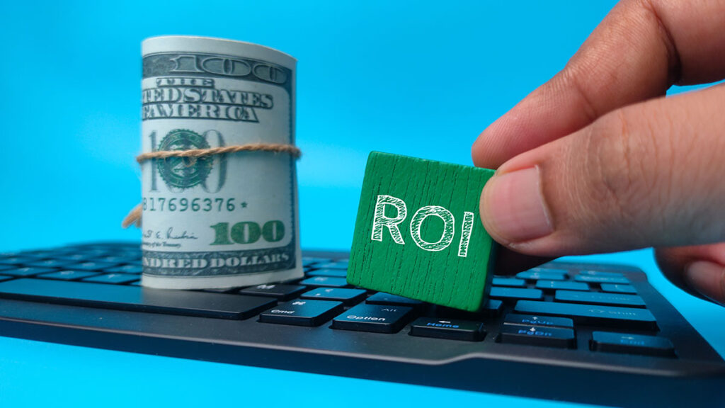
With your copy, layout, and images in place, your final step prior to launch is installing your tracking and analytics solutions. Data is crucial, regardless of what your quick build is. At least get Google Analytics up and running or integrate with Google Tag Manager so you can track traffic, bounce rate, and activity on page. If you’re promoting to the landing page, connect your Facebook Pixel, LinkedIn Insight Tag, or whatever your platform pixel is so you can properly attribute conversions.
Additionally, take time to define conversion events. They can be form submissions, button clicks, or scroll depth based on your objectives. Monitoring them allows you to constantly optimize your performance in future iterations as well as properly measure your ROI.
Once you know everything is going right—forms are submitting, mobile view is crisp, and analytics are set up—it’s time to launch. Most new builders offer one-click launch to a custom domain or subdomain. If you can, you want a branded domain that’s related to your offer and memorable. Try to go with something like “start.mysaas.com” as opposed to a generic builder address.
Once live, test your live link both from your own computer as well as from a mobile. Fill out a test form submission and verify that the info correctly flows into your backend or your CRM. Preview your link with a colleague or test using an incognito window to ensure that from a new user’s perspective, everything looks good. You don’t need perfect—but you absolutely need usability.
Conclusion
Creating a landing page in under two hours isn’t merely feasible—it’s a necessary skill for marketers and entrepreneurs who thrive on speed, agility, and efficiency. For marketers, you may have a campaign you want to launch with a specific deadline, or a new offer you want to validate before you commit to a full funnel. For both, having the ability to crank out a tight, fully-functional, conversion-optimized page represents a strong competitive advantage.
With intelligent planning, with efficient software, with concise messages, and with rapid action, you can go from concept to live page within a timeframe shorter than a webinar or strategy call uses. And with each repeat of this process, you won’t merely get faster—you’ll get better. Your copy will become more polished. Your layouts will get more compact. Your understanding of what succeeds—and what doesn’t—will become more deep.
With digital marketing, speed without strategy equals chaos—but strategy without speed equals stagnation. This two-hour landing page strategy combines both worlds: a fast, repeatable process with conversion best practices as its first principle and intentional focus. So go for it: next time you receive an idea, an ad budget, or a lead magnet you’re about to launch—don’t wait. Grab your builder, timer, and launch with intention. Because with digital business, momentum makes all the difference.